Hiperprostor
about project
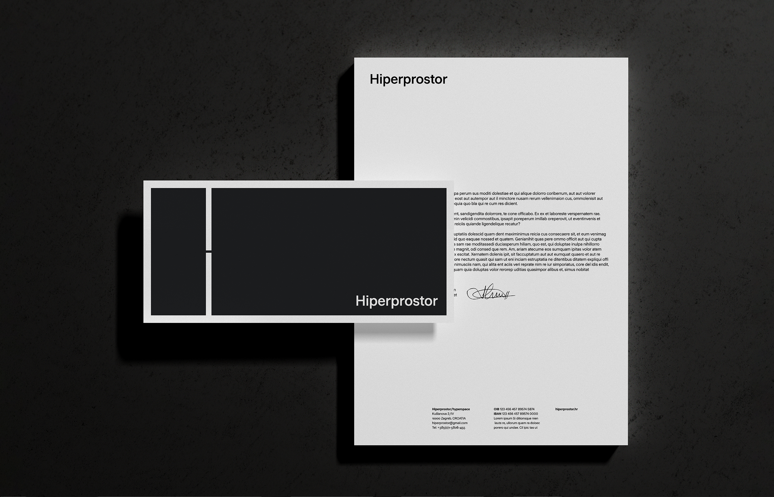
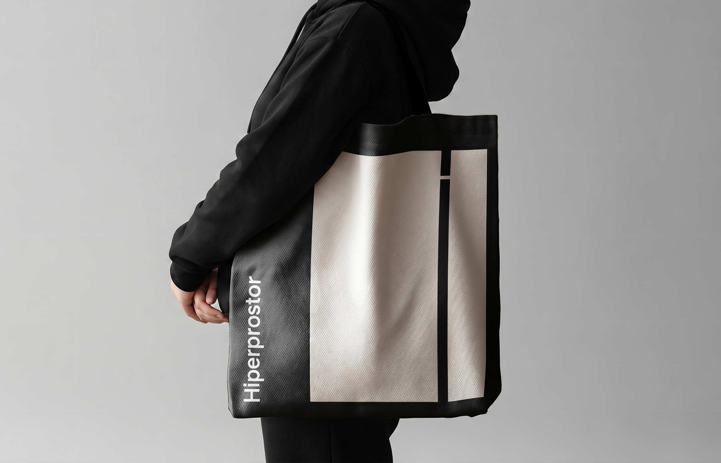
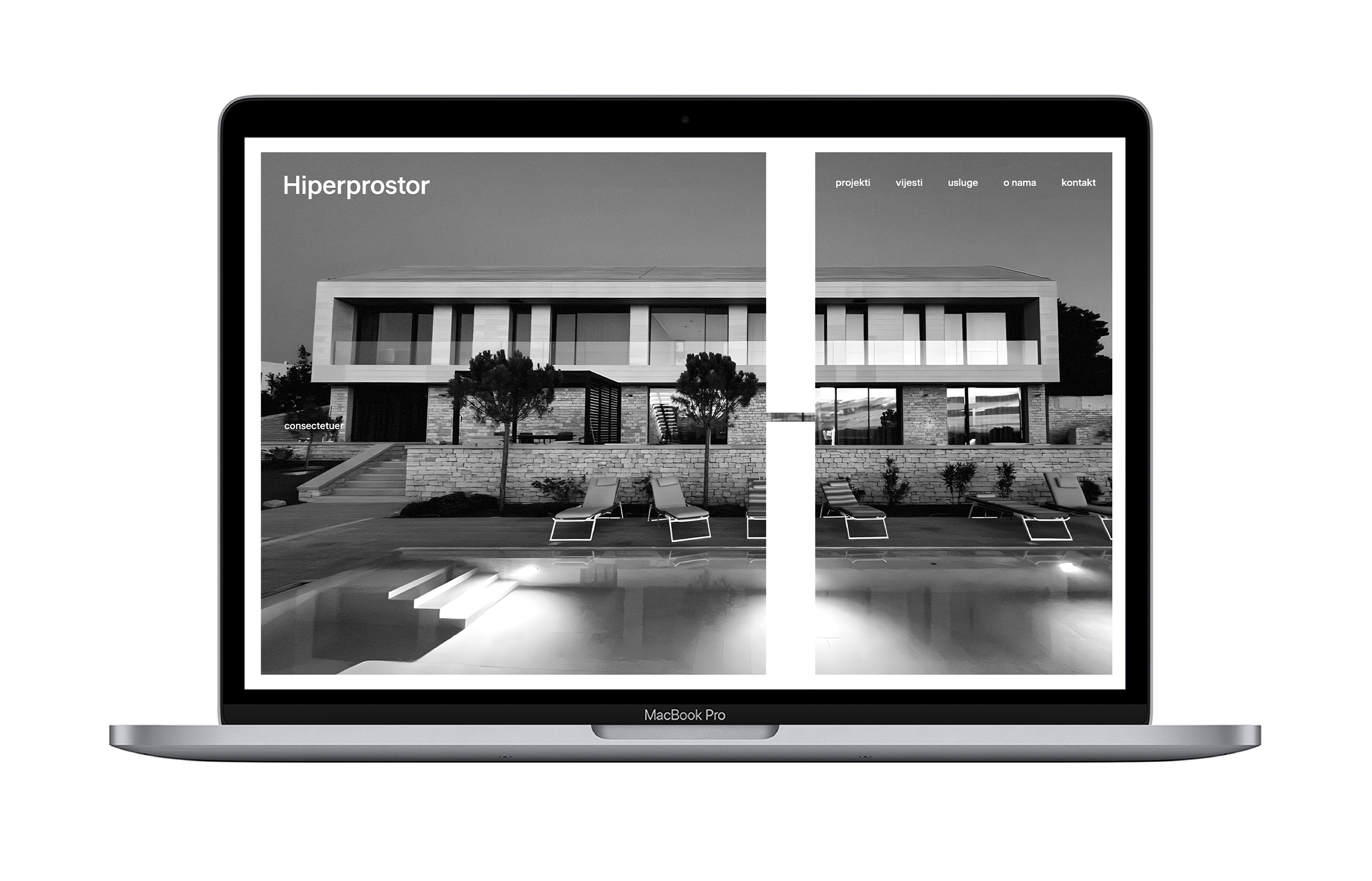
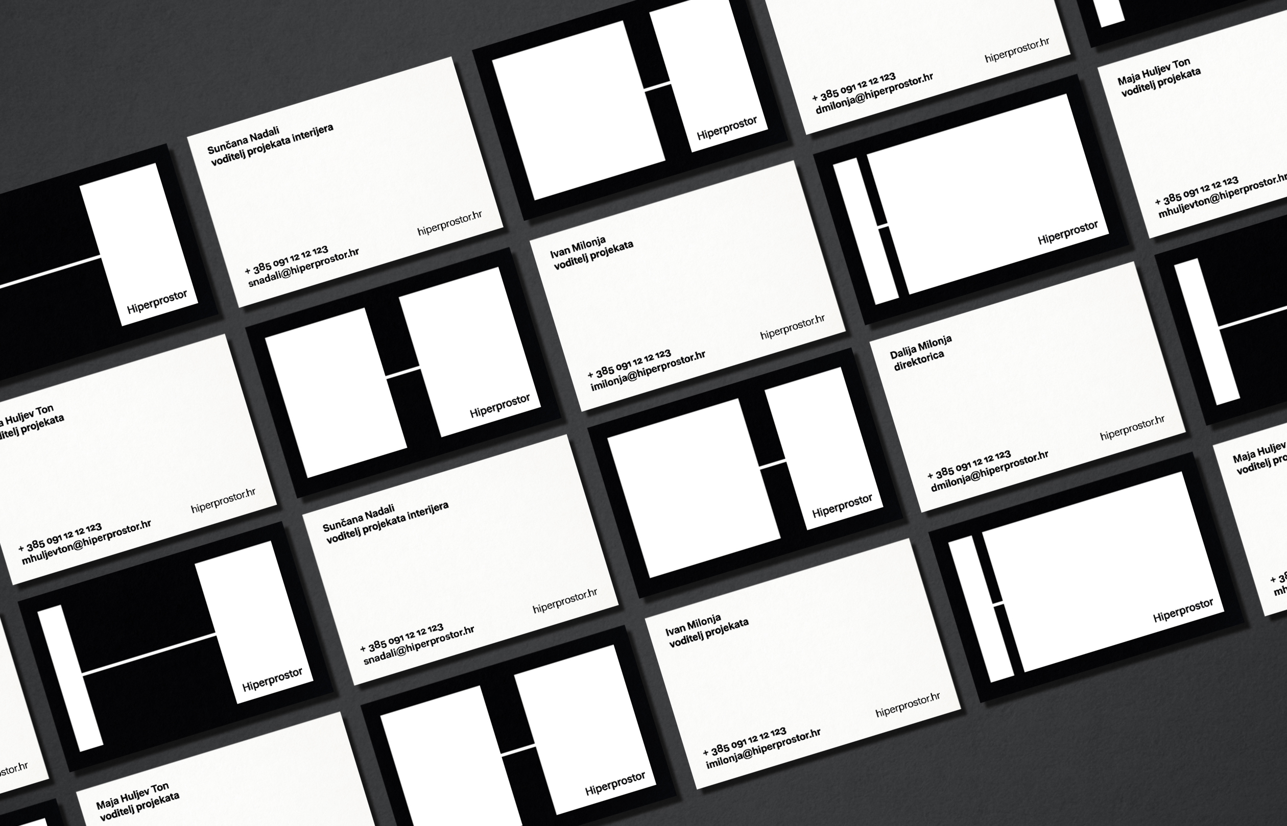
The visual identity for the architectural firm Hiperprostor is minimalist, modular, and rooted in the interplay between positive and negative space. The system is built around the initial letter H, which expands, contracts, and adapts to fill the given format. Inspired by architectural floor plans and technical drawings, the identity uses shifting proportions of the letterform to create a distinctive and dynamic visual language. The main motif is highly flexible and can adapt to different client needs and communication challenges — functioning as a photographic frame, a structural base for text layouts, a texture, or an animated element. A restrained color palette, grotesque typography, and black-and-white photography give the identity a clear, refined, and distinctly architectural character.