Signage


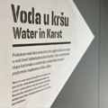
In the Velebit Nature Park, at the foot of the entrance to the Cerovac Caves, there is a newly opened visitor research center. Along the center there are access promenades and paths in caves. Our task was to design and supervise the performance of visual identity, signaling and interpretive graphics.
coauthor:
Iva Sindik
architecture:
Normala d.o.o.
Roman Šilje, arhitekt
Tihana Vučić, arhitektica
Stjepan Smolčić, arhitekt
interpretational texts:
Kazimir Miculinić
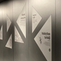
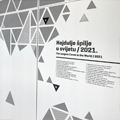
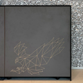


Milojević Polyclinic is one of the most modern anti-aging polyclinics in the region. In their new interior, we designed signage and art installations that illustrate certain segments of the polyclinic's activities in an abstract way. The main motif is always skin, which is presented through abstract shapes of various materials.
interior design:
Andrea Hržić Šesnić
art installation coauthors:
Matija Plavčić
Vjeran Palijan
photographies:
Bosnić + Dorotić


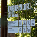
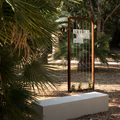
Project included design of paths, signage and interpretation for Botanical garden on Lokrum. Concept was to integrate the design with the main attraction (plants) - not to compete with it. Signs are not fixed but sway in the wind, the plants can embrace them and pass through the letters. Also, the materials from which the signage is made will ‘mature’ as will the plants around them.
Šesnić&Turković d.o.o.
Marko Šesnić, designer
Goran Turković, designer
Andrea Sužnjević, designer
Normala d.o.o.
Roman Šilje, architect
Milan Štrbac, architect
Tihana Vučić, architect
Katarina Ivanišin, ilustrator
exhibition:
croatian design exhibition 1920


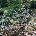
Interpretational elements are primarily intended for children, and the design interprets and follows various stylized forms from the everyday life of the Neanderthals. Each object calls for interaction with visitors inviting them to discover the content and learn from experience. Visitors can discover many interesting details about a particular topic by using their movements, which emphasizes the importance of physical presence at the location.
coauthors:
product design: Vedran Kasap and Ozana Ursić
graphic design: Goran Turković , Marko Šesnić, Andrea Sužnjević
interpretation plan: Dijana Hršak i Petra Bralić
trail reconstruction project: Kristina Radelić
collaborators
illustration: Andrea Sužnjević
interpretation texts: Dubravko Mihanović
geologist: Marijan Kovačić
Krapina Neanderthal Museum
project photographs:
Vedran Kasap
Mario Jurina
Petra Bralić


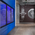
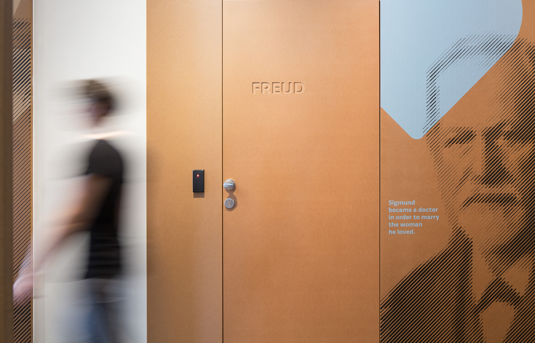
Infobip is a Croatian leading IT company that recently opened the biggest IT campus in the state. Our assignment was to create, with the friends from Fabrika who designed into interior, wall graphics. Those graphic had to be motivating to the employes and of course - decorative.
authors:
Iva SIndik
Željko Burić (Fabrika)
Anotonio Balzareno (Fabrika)
Marko Šesnić
Goran Turković
photographies: Rajan Milošević / Koridor27
exhibition:
Croatian Design Exhibition 1718
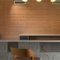


Sky Office is a Zagreb business centre, which is made up from two oval skyscrapers. The visual identity and signage are based on stylized raster of floors and windows of the skyscraper in such a way that one skyscraper is coded with horizontal lines, while the other is coded with vertical lines. That code is systematically carried out on all the elements of the identity; from the reception to the signage. The logo changes depending on its position – the location of the skyscraper in the logo corresponds to the perspective from which the buildings are observed.
Reception co-designers: Nikica Tabain & Nikola Šimunić


Architectural studio Hržić hired us to design signage for Zadar sports arena Višnjik, which was built for the World Handball Championship 2009.


Architectural studio Hržić hired us to design signage for Zadar sports arena Višnjik, which was built for the World Handball Championship 2009.


In 2008 the architectural bureau Hotel Design Studio hired us to design signage for the luxury apartment wing of hotel Istra, on Crveni Otok near Rovinj. Our goal was to design discreet signage, which will fit into the existing space.


In 2008 the architectural bureau Hotel Design Studio hired us to design signage for the luxury apartment wing of hotel Istra, on Crveni Otok near Rovinj. Our goal was to design discreet signage, which will fit into the existing space.