Packaging


We redesigned the Concoction series and designed the Collab series of Zmajska pivovara beers so that it is clear which brand produces them, but still have their own specific character.
coauthors:
Iva Sindik
Klara Zaher


We redesigned the Concoction series and designed the Collab series of Zmajska pivovara beers so that it is clear which brand produces them, but still have their own specific character.
coauthors:
Iva Sindik
Klara Zaher

Craft King is a new brand designed as an exclusive craft beer brand of the Eurospin chain of stores.
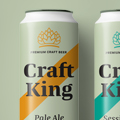
Craft King is a new brand designed as an exclusive craft beer brand of the Eurospin chain of stores.

DropSept and DropDefence are innovative ophthalmic preparations against common infections, but also for protection against UV light and blue light from the screen. The packaging is designed in such a way that the main motif is a stylized eye, and the main purpose of the preparation is subtly highlighted inside the eye. Continuing on the packaging, the visuals for the campaign continue to use the eye symbol, but the many benefits of the product are communicated through different graphic textures that simulate eye conditions that need to be treated.
coauthor:
Iva Sindik

BIO Q is a series of completely natural cosmetics without harmful substances for personal hygiene. The cosmetics were developed by Dr. sc. Zvonimira Mikotić Mihun, who spent most of her working life in the pharmaceutical industry, but always remained connected to science. The BIO Q line is sold in BioBoutique - a specialized store for natural cosmetics, also owned by Mrs. Mihun. In the design, it was important to develop the BIO Q sub-brand, but with a clear connection to the store, so the letter Q, which represents a stylized slip, is emphasized in the naming and design, just like in the store's logo.
coauthor:
Iva Sindik

The task was to create a series of wines that would primarily be used as a home offering in restaurants. Apart from the main restaurant owned by the customer, the series of wines would also be offered to other catering facilities. The goal is to create a recognizable visual style of labels that do not contain umbrella identity in order to better fit into different environments. The visual style is based on the names given by varieties or colloquial expressions associated with the variety.
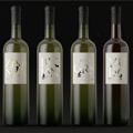
The task was to create a series of wines that would primarily be used as a home offering in restaurants. Apart from the main restaurant owned by the customer, the series of wines would also be offered to other catering facilities. The goal is to create a recognizable visual style of labels that do not contain umbrella identity in order to better fit into different environments. The visual style is based on the names given by varieties or colloquial expressions associated with the variety.
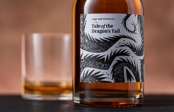
Zmajska pivovara is the first Croatian craft brewery, and Tale of the Dragon's Tale is their craft whiskey. Our task was to come up with a name, choose a bottle and design a label and a box.
coauthor:
Hana Vrca
photographer:
Domagoj Kunić


Zmajska pivovara is the first Croatian craft brewery, and Tale of the Dragon's Tale is their craft whiskey. Our task was to come up with a name, choose a bottle and design a label and a box.
coauthor:
Hana Vrca
photographer:
Domagoj Kunić

After several years of producing the experimental series of Brewers Concoction beer, Zmajska decided to move the series from bottles to cans.
coauthor:
Iva Sindik


After several years of producing the experimental series of Brewers Concoction beer, Zmajska decided to move the series from bottles to cans.
coauthor:
Iva Sindik

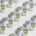
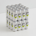
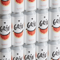
Hard seltzer is a new type of drink on the Croatian market. Basically it's mineral water, with fruit aroma and 5% alcohol. Grin is the first craft hard seltzer on our market. As it is a new sector of light alcoholic beverages - it was important for the design to leave the right impression of what kind of drink it is. The target group are young active people.
Lettering:
Marko Hrastovec
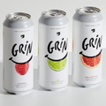

Lipički Studenac developed a completely new design a few years ago, but soon after that change they decided to use the old familiar design and mascot and play on the nostalgia of customers and win over a new younger audience with a cute bećar. We redesigned the mascot itself and created a new label design in which he is the main feature.
coauthor:
Iva Sindik

As a part of Pinch of Design we designed series of packaging for a Bocca Buona restaurant chain.
coauthor:
Andrea Sužnjević


As a part of Pinch of Design we designed series of packaging for a Bocca Buona restaurant chain.
coauthor:
Andrea Sužnjević

Zmajska pivovara hired us to design labels for their experimental series. This is a series of a small batch 'one time only' master brewer's experimental beers. We called the edition 'Brewer's concoction' and design it as a torn out paper, from a brewer's notebook, with the ingredients and main characteristics written on it. The only 'designed' element on the label is an illustration, and a beer name 'stamped' over the torn out paper.
coauthor:
Iva Sindik
exhibition:
croatian design exhibition 1920
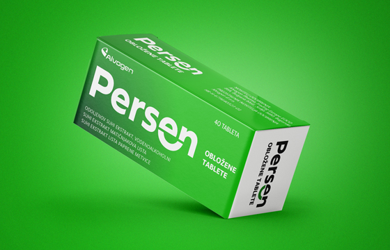
Visual identity and packaging redesign for a popular herbal medicine.
project partners:
Star Digital


Visual identity and packaging redesign for a popular herbal medicine.
project partners:
Star Digital

30th anniversary album contains all the greatest hits that Hladno pivo released in the last 30 years - from the early punk hits to the more recent rock ballads. Album design depicts an imaginary floor from one of the many clubs and venues that Hladno pivo played over the years.
exhibition:
Croatian Design Exhibition 1718

Emma&Nala is a Croatian maker of unique, hand-made women’s jewelry. They hired us to design their brand’s visual identity and packaging.


Emma&Nala is a Croatian maker of unique, hand-made women’s jewelry. They hired us to design their brand’s visual identity and packaging.

II is a third Skaut’s studio album. Band’s brief was: We want a rock’n’roll cover, not some designer nonsense.
author:
Marinko Murgić


II is a third Skaut’s studio album. Band’s brief was: We want a rock’n’roll cover, not some designer nonsense.
author:
Marinko Murgić

Design for the new music album "Days of closed doors" by "Hladno pivo", the most popular croatian punk rock band.
collaborator: Andrea Sužnjević


Design for the new music album "Days of closed doors" by "Hladno pivo", the most popular croatian punk rock band.
collaborator: Andrea Sužnjević

Ili_ili is a system of modular lights which gives the user the freedom to assemble a lamp of unique shape and color. Our colleagues and friends from Grupa Products asked us to create a visual identity and packaging for the lamps. The design process was challenging and complex, as we wanted simple and efficient packaging for thousands of different combinations.
visual identity co-author: Marinko Murgić
packaging co-author: Andrea Sužnjević

Redesign of one of Klara’s oldest shortcakes. The task was to modernize the packaging, but to keep the recognizable identity which induces nostalgia with the customers.
lettering: Marko Hrastovec
packshots: Domagoj Kunić


Redesign of one of Klara’s oldest shortcakes. The task was to modernize the packaging, but to keep the recognizable identity which induces nostalgia with the customers.
lettering: Marko Hrastovec
packshots: Domagoj Kunić

Edicta Pharm is a pharmaceutical company which sells prescription drugs. The assignment was to design a set of drugs packaging, and to implement a visual system into which future drugs can be easily incorporated.
exhibition:
- 2014. Croatian Design Exhibition 1314


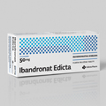


Edicta Pharm is a pharmaceutical company which sells prescription drugs. The assignment was to design a set of drugs packaging, and to implement a visual system into which future drugs can be easily incorporated.
exhibition:
- 2014. Croatian Design Exhibition 1314

Leo Gracin and Vedran Kiriđija combined their excellent wines into a new wine named Kontra. We designed the label which is contra to a classic label design. In place of the label there is the bottle and in place of the bottle there is the label.
exhibition:
- 2014. Croatian Design Exhibition 1314
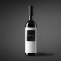

Leo Gracin and Vedran Kiriđija combined their excellent wines into a new wine named Kontra. We designed the label which is contra to a classic label design. In place of the label there is the bottle and in place of the bottle there is the label.
exhibition:
- 2014. Croatian Design Exhibition 1314

A DVD catalogue of Zagreb National Theatre, which holds all the relevant information about the building and its history.
illustrator: Tomislav Tomić


A DVD catalogue of Zagreb National Theatre, which holds all the relevant information about the building and its history.
illustrator: Tomislav Tomić

Micica are fashion accessories from the creative duo Doris Fatur and Stefano Katunar from Rijeka. The visual identity is made up from distinguishing illustrations, which are one of the main elements of Micica jewellery, as well as a logo with a tail in order to visually emphasise the name “micica”, an endearing name for a cat.


Micica are fashion accessories from the creative duo Doris Fatur and Stefano Katunar from Rijeka. The visual identity is made up from distinguishing illustrations, which are one of the main elements of Micica jewellery, as well as a logo with a tail in order to visually emphasise the name “micica”, an endearing name for a cat.

The packaging for the promo DVD of Croatian animated films was made for the festival in the French city of Annecy. By turning the DVD, the user changes the slogan on the packaging.


The packaging for the promo DVD of Croatian animated films was made for the festival in the French city of Annecy. By turning the DVD, the user changes the slogan on the packaging.
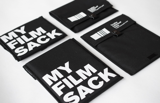
The Croatian Audiovisual Centre is actively promoting Croatian films by offering screeners to various festivals around the world. Since not every Croatian film has its own design, a universal packaging was designed for such screeners. This “DVD sack” is designed in such a way that it can contain DVDs in its original packaging.
coauthors: Ivana ivišić & Tomislav Petković

The Croatian National Theatre in Zagreb commissioned us to design wine labels for wines which are served at their premieres. The concept for wine labels followed the visual style of the National Theatre and presented the three main segments of their production – opera, drama, ballet.
illustrator: Tomislav Tomić

Razatuša is a family-produced olive oil. The oil is of superior quality and because of limited production, only a part of it is available for general sale. The label for Razatuša is printed on raw cotton fabric and stitched through. That way we avoided the imprecise hand labelling or using an automatic labelling machine, and we emphasized the charm of family, hand-made production.
award:
- Red Dot award 2012
exhibitions:
- 2012 Zgraf 11
- 2012 Croatian Design Exhibition 1112
- 2012 23rd Biennial of Industrial Design
ilustrator: Tomislav Tomić