

Fakat is one of the biggest rental companies in Croatia and an event agency. We designed their visual identity and produced a series of illustrations.


Fakat is one of the biggest rental companies in Croatia and an event agency. We designed their visual identity and produced a series of illustrations.

Zeitreise (Time travel) is a children"s show and presents history divided into periods: dinos, jellyfishes, cavemen, ancient Egypt, vikings

Zeitreise (Time travel) is a children"s show and presents history divided into periods: dinos, jellyfishes, cavemen, ancient Egypt, vikings


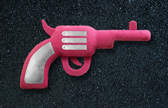
Koart is a business that makes advertising materials from textile and leather. Our frequent collaborators hired us to design their visual identity, web-site, and promo catalogue. The catalogue is designed so present and future clients can browse all the products and services, and at the same time they can feel the materials and see the prints and stitching on them.


Koart is a business that makes advertising materials from textile and leather. Our frequent collaborators hired us to design their visual identity, web-site, and promo catalogue. The catalogue is designed so present and future clients can browse all the products and services, and at the same time they can feel the materials and see the prints and stitching on them.

Handymen is croatian comedy by Dalibor Matanić.
photography: Vanja Černjul

Handymen is croatian comedy by Dalibor Matanić.
photography: Vanja Černjul

Kavanica is a café bar in Varšavska Street in Zagreb, decorated in the manner of old Zagreb coffee houses. The owners wanted to offer the feel of legendary coffee houses from the age of top hats and tuxedos.
co-author: Marinko Murgić


Kavanica is a café bar in Varšavska Street in Zagreb, decorated in the manner of old Zagreb coffee houses. The owners wanted to offer the feel of legendary coffee houses from the age of top hats and tuxedos.
co-author: Marinko Murgić

Sky Office is a Zagreb business centre, which is made up from two oval skyscrapers. The visual identity and signage are based on stylized raster of floors and windows of the skyscraper in such a way that one skyscraper is coded with horizontal lines, while the other is coded with vertical lines. That code is systematically carried out on all the elements of the identity; from the reception to the signage. The logo changes depending on its position – the location of the skyscraper in the logo corresponds to the perspective from which the buildings are observed.
Reception co-designers: Nikica Tabain & Nikola Šimunić

At the beginning of each year Croatian Audiovisual Centre makes catalogues to promote Croatian films at festivals in Berlin, Cannes, Clermont Ferrand, Annecy… A new design is made every year, which is systematically applied to promotional materials and stands during the year.


At the beginning of each year Croatian Audiovisual Centre makes catalogues to promote Croatian films at festivals in Berlin, Cannes, Clermont Ferrand, Annecy… A new design is made every year, which is systematically applied to promotional materials and stands during the year.


Dubrovnik is a world famous city of unique beauty and rich history. The city walls are one of the most famous landmarks. Our idea works on that well-known image, and upgrades it with HEART OF ART. For Dubrovnik truly has a heart of art. The key visual element of this year’s games, the resemblance of the heart and the city’s layout, seems obvious, which perfectly emphasises the parallel between the architecture of the city and the anatomy of a living organism which lives and celebrates art. The Dubrovnik we speak of is not made of stone, but pure emotion.
copywriter and co-author: Maro Pitarević
exhibition:
- 2014. Croatian Design Exhibition 1314

Hush... is a Croatian movie by Lukas Nola. The movie is based around the growing up of a girl who is sexually and physically abused by all men who are close to her.
exhibition:
- 2014. Croatian Design Exhibition 1314

Hush... is a Croatian movie by Lukas Nola. The movie is based around the growing up of a girl who is sexually and physically abused by all men who are close to her.
exhibition:
- 2014. Croatian Design Exhibition 1314

A DVD catalogue of Zagreb National Theatre, which holds all the relevant information about the building and its history.
illustrator: Tomislav Tomić


A DVD catalogue of Zagreb National Theatre, which holds all the relevant information about the building and its history.
illustrator: Tomislav Tomić

In 2010 eight countries of south-eastern Europe decided to take part at the Cannes Film Festival Market together, and have continued to do so since then. The visual identity of SEEP is designed to change every year, but within the same graphic language. The design itself is based on the work of Eadweard Muybridge, a film pioneer who was interested in photographing motions.


In 2010 eight countries of south-eastern Europe decided to take part at the Cannes Film Festival Market together, and have continued to do so since then. The visual identity of SEEP is designed to change every year, but within the same graphic language. The design itself is based on the work of Eadweard Muybridge, a film pioneer who was interested in photographing motions.

A Palace and a Museum is an exhibition at the Archaeological Museum in Zagreb. The exhibition simultaneously follows the history of the museum and the history of the palace on Zrinjevac Square, where it has been located since 1945. The exhibition was designed so the audience follows two ribbons, one which follows the history of the museum, and the other which follows the history of the palace. Both ribbons start out at the entrance to the museum and serve as a distinctive spatial marker. The ribbons enter the museum and lead the visitors to the exhibition space, where they separate into smaller threads and lead to separate exhibits. The visitors are guided through the exhibition via a real spatial timeline.
coauthor: Ivan Veljača

Vizkultura.hr is a web-site for visual culture. For the launch of their print campaign, they had 17 Croatian design studios create original posters on the topic of visual culture in Croatia. We were one of the invited authors, and we designed a poster which is our personal commentary on the state of visual culture in our country.
exhibition:
- 2014. Croatian Design Exhibition 1314
- 2014. Dozvoljeno plakatiranje, Gallery HDD

The Mysterious Boy is a Croatian children’s blockbuster, the sequel to the movie Koko and the Ghosts. The story is based on Ivan Kušan’s famous novel.

The Mysterious Boy is a Croatian children’s blockbuster, the sequel to the movie Koko and the Ghosts. The story is based on Ivan Kušan’s famous novel.

Adria Hotel Forum is a conference about hotel management, which was held in Zagreb for the first time. The logo is a combination of a recognizable symbol for hotels and a “speech balloon” which emphasises communication.
Adria Hotel Forum is a conference about hotel management, which was held in Zagreb for the first time. The logo is a combination of a recognizable symbol for hotels and a “speech balloon” which emphasises communication.

Teleport Zovko is a short film by Peđa Ličina. The film is a comic science fiction which takes place in Croatia in 2050. Teleporters are used all over the world, and the first teleporter operator finally found its way to Croatia – Teleport Zovko.
authors: Marinko Murgić, Šesnić&Turković

Teleport Zovko is a short film by Peđa Ličina. The film is a comic science fiction which takes place in Croatia in 2050. Teleporters are used all over the world, and the first teleporter operator finally found its way to Croatia – Teleport Zovko.
authors: Marinko Murgić, Šesnić&Turković

Micica are fashion accessories from the creative duo Doris Fatur and Stefano Katunar from Rijeka. The visual identity is made up from distinguishing illustrations, which are one of the main elements of Micica jewellery, as well as a logo with a tail in order to visually emphasise the name “micica”, an endearing name for a cat.


Micica are fashion accessories from the creative duo Doris Fatur and Stefano Katunar from Rijeka. The visual identity is made up from distinguishing illustrations, which are one of the main elements of Micica jewellery, as well as a logo with a tail in order to visually emphasise the name “micica”, an endearing name for a cat.

Micica are fashion accessories from the creative duo Doris Fatur and Stefano Katunar from Rijeka. The visual identity is made up from distinguishing illustrations, which are one of the main elements of Micica jewellery, as well as a logo with a tail in order to visually emphasise the name “micica”, an endearing name for a cat.
exhibition:
- 2014. Croatian Design Exhibition 1314

Aida was coproduced between Zagreb National Theatre and Rijeka National Theatre. The concept was a modern interpretation of this rich, Egyptian-themed opera. Egyptian iconography was completely omitted in both stage and costume design. Following the director’s concept of the opera, the poster is a modern interpretation of Egyptian hieroglyphs. The plot is told through four letters/hieroglyphs.
handbag design: Danijela Štambuk

Presjek is a magazine for detail in architecture. Each issue has a specific topic (wood, concrete, façade…). The editorial concept for the magazine is that every issue can serve as long-term literature for architects. For that reason, the cover is designed to visualize the topic of the issue in the clearest possible manner.
exhibitions:
- 2012 Zgraf 11
- 2012 Croatian Exhibition design 1112

The advertisement for the Milojević clinic promotes one of the most advanced technologies for cellulite and fat tissue removal.

The advertisement for the Milojević clinic promotes one of the most advanced technologies for cellulite and fat tissue removal.

Judgment Day is a festival of creative communications i.e. a festival of design and advertising. Every year, the visual identity and campaign is made by different authors, and in 2012 one of the organizers, Maro Pitarević, invited us. We based the campaign and visual identity on “Kosturko” – the supreme judge of Judgment Day. Kosturko is cynical, mean, and primitive, and his character and appearance are a part of the campaign.


Judgment Day is a festival of creative communications i.e. a festival of design and advertising. Every year, the visual identity and campaign is made by different authors, and in 2012 one of the organizers, Maro Pitarević, invited us. We based the campaign and visual identity on “Kosturko” – the supreme judge of Judgment Day. Kosturko is cynical, mean, and primitive, and his character and appearance are a part of the campaign.

In pre-Christmas period, we are faced with a challenge of designing Christmas materials which are not kitsch. This time we managed to avoid that by asking ourselves how the world’s greatest playwright would celebrate Christmas.


In pre-Christmas period, we are faced with a challenge of designing Christmas materials which are not kitsch. This time we managed to avoid that by asking ourselves how the world’s greatest playwright would celebrate Christmas.

The Christmas banquet of the Croatian Audiovisual Centre is a traditional event, which gathers a large number of filmmakers over food and drinks.

The Christmas banquet of the Croatian Audiovisual Centre is a traditional event, which gathers a large number of filmmakers over food and drinks.

Days of Croatian Film were held in Paris as a part of the Croatian “Saison culturelles”. Our movies and actors are generally not known to the French audience, so we decided to draw attention with a “surreal” motif, made up from nine symbols which are connected to movie titles. In all other printed materials, the user can cut out the motifs and create his own collage.


Days of Croatian Film were held in Paris as a part of the Croatian “Saison culturelles”. Our movies and actors are generally not known to the French audience, so we decided to draw attention with a “surreal” motif, made up from nine symbols which are connected to movie titles. In all other printed materials, the user can cut out the motifs and create his own collage.


In 2012 the Croatian Film Archive marked the World Day for Audiovisual Heritage by screening a few of the censored movies from Croatian history. The star of the show was the movie Ciguli Miguli, which was censored by the communist government in 1952. The poster’s main visual was the name of the movie “censored” with the red star.
exhibition:
- 2014. Croatian Design Exhibition 1314

The “Faust Vrančić” Memorial Centre on Prvić Island (Prvić Luka) was a special project for us, because we designed its visual identity, as well as the exhibition layout and multimedia, in collaboration with Peračić Architectural Workshop and Kinoteka Production Company. During our research we found out that beside the parachute, Faust Vrančić invented numerous mills, bridges, wind mills etc... and that he was a real “homo universalis”. That was an excellent starting point for the visual identity as we wanted to use all means of communication to educate potential visitors about Faust’s field of work and to motivate them to visit the memorial centre.
exhibition:
- 2014. Croatian Design Exhibition 1314

The packaging for the promo DVD of Croatian animated films was made for the festival in the French city of Annecy. By turning the DVD, the user changes the slogan on the packaging.

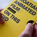

The packaging for the promo DVD of Croatian animated films was made for the festival in the French city of Annecy. By turning the DVD, the user changes the slogan on the packaging.

The Introduction to Ballet is a booklet for girls aged 4-12. It is designed as a simple, educational publication, which describes and illustrates the basic aspects of the art of ballet. The history and rules of ballet are explained by “Biba”, who is the main character of the ballet souvenir collection of the Zagreb National Theatre.
photographer: Damil Kalogjera
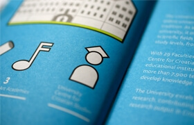
The Office for International Relations of the University of Zagreb regularly prints a guide for international students. The guide contains basic information about Zagreb and the university itself, as well as all study programmes in English. The guide is designed as a pocket notebook containing all the necessary information, and has a USB stick integrated in its covers.
authors: Marinko Murgić, Šesnić&Turković

War and Peace is a theatre play in which director Tomaž Pandur deals with the relation and influence of war to peace and vice versa. The poster closely follows that concept. Half of the red cross was printed and the full cross was achieved by folding freshly printed paper. By doing so, peace literally affects war and each poster is also unique, because there are no two prints alike.
award:
- Red Dot Award 2012
exhibitions:
- 2012 - Zgraf 11
- 2012 - Croatian Design Exhibition 1112
- 2012 - 23rd Biennial of Industrial Design

Tea Mamut is a renowned Croatian pastry chef, who worked in some of the most prestigious restaurants in the world. We designed a series of business cards that have an added value – they contain Tea’s advice for preparing desserts and a few recipes. The main visual is an illustration of the dessert described in the recipe on the card.
author: Marinko Murgić


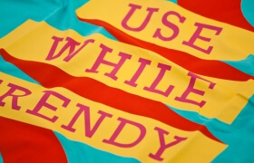
Lega-Lega is a brand of uniquely designed paper and textile products from Osijek. In 2011 they produced a series of limited gift packages. Street-artist Lunar and us were the first to be invited to design our own series. The concept of our d-box was our studio’s manifest of sorts. We designed in a (then) trendy way a sign “Use while trendy”, and all the products contain a tiny disclaimer: Exp. Date 6 months.
coauthors: Lega-Lega
In 2012 Ina Expert from France started a project for conserving audiovisual legacy in the Balkans. The project should last a few years, and conferences and educations will move from country to country. The main visual for the project’s identity is the letter B made from stylized antique montage table.


In 2012 Ina Expert from France started a project for conserving audiovisual legacy in the Balkans. The project should last a few years, and conferences and educations will move from country to country. The main visual for the project’s identity is the letter B made from stylized antique montage table.


The visual identity for Jukopila attorney’s office is based on the initial which, with minimal intervention, resembles scales – the symbol of justice.


The visual identity for Jukopila attorney’s office is based on the initial which, with minimal intervention, resembles scales – the symbol of justice.


Opera fans have a reputation for being the most passionate and faithful audience. With that in mind, we designed an opera collection of souvenirs based on passion towards music.


Opera fans have a reputation for being the most passionate and faithful audience. With that in mind, we designed an opera collection of souvenirs based on passion towards music.

Sandra Tribuson’s poetry collection is designed as a writing block. Sandra’s poems are intimate, modest, and diary-like, so the collection is designed to communicate those qualities.


Sandra Tribuson’s poetry collection is designed as a writing block. Sandra’s poems are intimate, modest, and diary-like, so the collection is designed to communicate those qualities.

Promo brochure for the Milojević clinic, one of the most advanced anti-ageing clinics in the region. The brochure contains a complete list of treatments and procedures, and it is packaged into a “crumpled” wrapper with a face printed on it, reminding us of aging.


Promo brochure for the Milojević clinic, one of the most advanced anti-ageing clinics in the region. The brochure contains a complete list of treatments and procedures, and it is packaged into a “crumpled” wrapper with a face printed on it, reminding us of aging.

We made relief graphics for the office of Dr Nikola Milojević, one of the most renowned London aesthetic doctors. The graphics are stylized images of the eye, nose and lips – the parts of the face which are most frequently subjected to aesthetic correction in the clinic. The graphics are unique and made from lacquered mediapan.


We made relief graphics for the office of Dr Nikola Milojević, one of the most renowned London aesthetic doctors. The graphics are stylized images of the eye, nose and lips – the parts of the face which are most frequently subjected to aesthetic correction in the clinic. The graphics are unique and made from lacquered mediapan.
Kic Klub – café bar and photo gallery is a part of the Cultural and Information Centre. The main symbol of their visual identity is a clothes-peg which photography enthusiasts connect with photograph drying. “The clothes-peg” is the lynchpin of the visual identity because it “holds” the information.
co-author: Marinko Murgić
collaborator: Bojan Drezgić
exhibition:
- 2012. Croatian Design Exhibition 1112
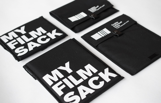
The Croatian Audiovisual Centre is actively promoting Croatian films by offering screeners to various festivals around the world. Since not every Croatian film has its own design, a universal packaging was designed for such screeners. This “DVD sack” is designed in such a way that it can contain DVDs in its original packaging.
coauthors: Ivana ivišić & Tomislav Petković

At Christmas, we use photo and video cameras in order to capture memories. The Croatian Audiovisual Centre upholds that tradition with this card.

At Christmas, we use photo and video cameras in order to capture memories. The Croatian Audiovisual Centre upholds that tradition with this card.

Koko and the Ghosts is a Croatian children’s blockbuster from Ivan Kušan’s famous novel of the same name. The movie drew an audience of more than 80000, and it was the most viewed Croatian movie in 2012.

Koko and the Ghosts is a Croatian children’s blockbuster from Ivan Kušan’s famous novel of the same name. The movie drew an audience of more than 80000, and it was the most viewed Croatian movie in 2012.

The ballet collection of souvenirs is mainly for girls aged 1-12. We designed “Biba”, a girl with excellent ballet skills. She is featured on all souvenirs, with a tiny textual explanation of the ballet position “Biba” is performing.
bag designer: Danijela Štambuk


The ballet collection of souvenirs is mainly for girls aged 1-12. We designed “Biba”, a girl with excellent ballet skills. She is featured on all souvenirs, with a tiny textual explanation of the ballet position “Biba” is performing.
bag designer: Danijela Štambuk

The Croatian National Theatre in Zagreb commissioned us to design wine labels for wines which are served at their premieres. The concept for wine labels followed the visual style of the National Theatre and presented the three main segments of their production – opera, drama, ballet.
illustrator: Tomislav Tomić

Children’s rights festival is a non-commercial project organized by UNICEF. Its basic mission is to educate the public about children’s rights.

Children’s rights festival is a non-commercial project organized by UNICEF. Its basic mission is to educate the public about children’s rights.

Razatuša is a family-produced olive oil. The oil is of superior quality and because of limited production, only a part of it is available for general sale. The label for Razatuša is printed on raw cotton fabric and stitched through. That way we avoided the imprecise hand labelling or using an automatic labelling machine, and we emphasized the charm of family, hand-made production.
award:
- Red Dot award 2012
exhibitions:
- 2012 Zgraf 11
- 2012 Croatian Design Exhibition 1112
- 2012 23rd Biennial of Industrial Design
ilustrator: Tomislav Tomić

I Gave Gold for Iron is a catalogue of World War I collections of the Croatian History Museum. This ambitious project lasted more than 18 months and resulted in an impressive book more than 600 pages long.


I Gave Gold for Iron is a catalogue of World War I collections of the Croatian History Museum. This ambitious project lasted more than 18 months and resulted in an impressive book more than 600 pages long.

In 2006 we won the public competition for the University Fair campaign. The Fair’s basic function is to introduce high-school graduates with faculties in Zagreb, entry exams, possible careers, etc… From 2006 to 2011 we have designed seven consecutive campaigns for the University Fair.
award:
- 1. award at a public competition 2006

Milojević Clinic is the most advanced anti-ageing clinic in the region. Its founder Dr Nikola Milojević, is one of the leading London experts in aesthetic medicine. We did the whole visual identity for the clinic, from the business card and brochure to the signage… The clinic’s logo is a combination of the letter “m”, as an initial, and the symbol for infinity, because anti-ageing treatments are the clinic’s main field of work. Since its inception we take care of all the clinic’s promo materials.
web developing:
Saša Djačanin (STO2)
Film by Aldo Tardozzi is based on a story about an evening-long friendship between two sixteen-year-old girls. They are both young and immature, and during the evening they participate in many “adult” situations – robbery, drug abstinence crisis, murders, etc…
exhibition:
- 2012 Croatian Design Exhibition 1112

The visual for the collection, for one of Krleža’s most famous dramas, are scissors, which are one of the key motifs, and which contain the initial of the title.
illustrator: Tomislav Tomić


The visual for the collection, for one of Krleža’s most famous dramas, are scissors, which are one of the key motifs, and which contain the initial of the title.
illustrator: Tomislav Tomić


7 in Heaven is a project for DVD tour guides. The concept for the guides is to present to the tourist the very best of a particular region/city which can be experienced in seven “heavenly” days of a tourist stay.


7 in Heaven is a project for DVD tour guides. The concept for the guides is to present to the tourist the very best of a particular region/city which can be experienced in seven “heavenly” days of a tourist stay.

Since “Hamlet” is rarely performed as an opera, we designed the visual of the collection which emphasizes the musical component on Hamlet’s most famous symbol – the human skull.


Since “Hamlet” is rarely performed as an opera, we designed the visual of the collection which emphasizes the musical component on Hamlet’s most famous symbol – the human skull.

The Croatian Audiovisual Centre introduced a system of tax refunds to foreign film producers who film in Croatia. This novelty was presented to the film public through a series of ads published in foreign specialized film publications. We presented Croatia as a top destination for filming by emphasising a few extremely rare phenomena or locations which cannot be filmed in Croatia.


The Croatian Audiovisual Centre introduced a system of tax refunds to foreign film producers who film in Croatia. This novelty was presented to the film public through a series of ads published in foreign specialized film publications. We presented Croatia as a top destination for filming by emphasising a few extremely rare phenomena or locations which cannot be filmed in Croatia.


A souvenir for the drama about Marija Jurić Zagorka, a famous Croatian writer and first Croatian female journalist.


A souvenir for the drama about Marija Jurić Zagorka, a famous Croatian writer and first Croatian female journalist.


Industrial and stage designer Ivan Veljača started a brand named Fabruary. Our goal was to design the visual identity and leaflets for his stand at D-Day market in 2010. We made an “envelope” around the stand made out of posters. The posters were perforated so every poster contained fifty flyers. As visitors tore the flyers off “the wall”, the contents of the stand were revealed.
coauthor: Ivan Veljača

The exhibition in honour of one of Croatia’s best graphic designers, Vanja Cuculić, is designe
which is divided into rooms of the stylized apartment, in order to bring them closer to the audience and to emphasize the omnipresence of design in everyday life.
awards:
- Red Dot - Best of the Best Award 2010
- Judgement Day Award 2010
exhibitions:
- 2010 Croatian Design Exhibition 0910
- 2012 Zgraf 11
- 2012 23rd Biennial of Industrial Design
wall paintings:
Stefano Katunar

The exhibition in honour of one of Croatia’s best graphic designers, Vanja Cuculić, is designed as a paraphrased designer’s apartment. The works are integrated into the layout, which is divided into rooms of the stylized apartment, in order to bring them closer to the audience and to emphasize the omnipresence of design in everyday life.


The exhibition in honour of one of Croatia’s best graphic designers, Vanja Cuculić, is designed as a paraphrased designer’s apartment. The works are integrated into the layout, which is divided into rooms of the stylized apartment, in order to bring them closer to the audience and to emphasize the omnipresence of design in everyday life.

The main motif is the designer’s profile made of illustrations of half-opened drawers. Both the advertisements and the catalogue feature profiles made from illustrations, which symbolize the designer’s field of work; posters, wine labels, books, identities and tourist destinations.
awards:
- Red Dot - Best of the Best Award 2010
- Judgement Day Award 2010
exhibitions:
- 2010 Croatian Design Exhibition 0910
- 2012 Zgraf 11
- 2012 23rd Biennial of Industrial Design
wall paintings:
Stefano Katunar

Šuma summarum is a Croatian movie. The plot thickens when 20 people enter a forest. Soon that forest becomes the stage for differently motivated murders. The film has no specific genre; it has the characteristics of dark comedy, action, thriller…


Šuma summarum is a Croatian movie. The plot thickens when 20 people enter a forest. Soon that forest becomes the stage for differently motivated murders. The film has no specific genre; it has the characteristics of dark comedy, action, thriller…

Kinoteka is a film production company. The owner is a multidisciplinary artist who works in production, photography, filming, montage, design… The visual identity communicates the creativity of the company as its biggest value, because the materials are not printed, they are hand-made – with stencils and stamps. A few stencilled logos were produced, and the logo itself is designed to be used as a negative and a positive stencil. Kinoteka’s owner makes unique corporate materials for every need, and he himself chooses the design, colours, materials and size.
exhibition:
- 2010 Croatian Design Exhibition 0910

MasMas is a production company for movies and TV content. The company wanted the logo to be “masculine” and to be undersigned with “film & entertainment”. Guided by these requests we made a logo which successfully communicates all of the above.


MasMas is a production company for movies and TV content. The company wanted the logo to be “masculine” and to be undersigned with “film & entertainment”. Guided by these requests we made a logo which successfully communicates all of the above.

In 2010 the Croatian National Theatre opened its Souvenir Shop, and soon after they hired us to design a few souvenir collections. Among the first were the collections for the ballet “Nutcracker” and opera “Die Fledermaus” (The Bat).


In 2010 the Croatian National Theatre opened its Souvenir Shop, and soon after they hired us to design a few souvenir collections. Among the first were the collections for the ballet “Nutcracker” and opera “Die Fledermaus” (The Bat).

Graduation ceremonies for PhDs of the University of Zagreb is accompanied by a book of PhDs. It is an edition containing basic information about each doctoral candidate and their doctoral thesis. Doctoral graduations are held twice a year, and there have been 17 books of PhDs so far.


Graduation ceremonies for PhDs of the University of Zagreb is accompanied by a book of PhDs. It is an edition containing basic information about each doctoral candidate and their doctoral thesis. Doctoral graduations are held twice a year, and there have been 17 books of PhDs so far.

Along with a few Croatian advertising companies, Women’s Room hired us to design a campaign against sexual abuse against women. The ads are designed as simplified visualizations of staggering statistical data.


Along with a few Croatian advertising companies, Women’s Room hired us to design a campaign against sexual abuse against women. The ads are designed as simplified visualizations of staggering statistical data.

The invitation contains a short, illustrated plan of the wedding, and offers a solution for the headache the morning after – a pill.
exhibition:
- 2010 - Croatian Design Exhibition 0910


The invitation contains a short, illustrated plan of the wedding, and offers a solution for the headache the morning after – a pill.
exhibition:
- 2010 - Croatian Design Exhibition 0910

Georgi Dimitrov attorneys are one of the leading attorney offices in Macedonia. Not satisfied with visual identity propositions from Macedonia, Georgi turned to designers abroad and contacted us. We designed a visual identity, suitable for an attorney office, which subtly communicates that his office functions as a team.
web programming: Magić_Marinac

Our goal was to design a series of regulation manuals which are used by employees of the university. Manuals are usually monotone in design, and an unattractive read, so we tried to design practical handbooks which have a clear, distinctive component, but are at the same time obviously a part of the same system.


Our goal was to design a series of regulation manuals which are used by employees of the university. Manuals are usually monotone in design, and an unattractive read, so we tried to design practical handbooks which have a clear, distinctive component, but are at the same time obviously a part of the same system.
While collaborating with the Croatian History Museum, we designed five catalogues for their exhibitions and collections. Those catalogues are, in fact, very detailed and rich books.


While collaborating with the Croatian History Museum, we designed five catalogues for their exhibitions and collections. Those catalogues are, in fact, very detailed and rich books.

The Final Sacrament is a short film by Ivan Goran Vitez, and follows the village lynching of a local priest.
The Final Sacrament is a short film by Ivan Goran Vitez, and follows the village lynching of a local priest.

The award-winning work at the competition for the visual identity of the Croatian Audiovisual Centre, which was made in collaboration with Vanja Cuculić. HAVC’s logo is a schematic representation of most frequently used film formats (4:3, 16:9…) and a square, which is a link to the national identity. Since 2008 we have continuously worked on yearly designs and promo materials for HAVC.
coauthor: Vanja Cuculić

In 2006 we won the public competition for the University Fair campaign. The Fair’s basic function is to introduce high-school graduates with faculties in Zagreb, entry exams, possible careers, etc… From 2006 to 2011 we have designed seven consecutive campaigns for the University Fair.
exhibition:
- 2008 - Croatian Desing Exhibition 0708
book:
Croatian Design Now

Architectural studio Hržić hired us to design signage for Zadar sports arena Višnjik, which was built for the World Handball Championship 2009.


Architectural studio Hržić hired us to design signage for Zadar sports arena Višnjik, which was built for the World Handball Championship 2009.

In 2008 the architectural bureau Hotel Design Studio hired us to design signage for the luxury apartment wing of hotel Istra, on Crveni Otok near Rovinj. Our goal was to design discreet signage, which will fit into the existing space.


In 2008 the architectural bureau Hotel Design Studio hired us to design signage for the luxury apartment wing of hotel Istra, on Crveni Otok near Rovinj. Our goal was to design discreet signage, which will fit into the existing space.
The Music Parlour is conceived as a platform for development and presentation of young musicians, which includes concerts, as well as music workshops, residencies and stage performances, experimental jazz, audiovisual projects, musical installations, future jazz, contemporary music, post rock, innovations in the field of musical instruments, sound experiments, multi-instrumental music, dub, punk, rock, electro… This whole array of programme guidelines was visually translated to – the House of Music.
collaborators: Dario Dević i Hrvoje Živčić
Skira - architectural lighting design is a leading Croatian design studio for lighting integrated into architecture. Their visual identity is based on Skira"s design "signature" - lines of light integrated into walls and ceilings.
exhibitions:
- 2010 - Croatian design Exhibition 0910
- 2010 - 22nd Biennial of Industrial Design